# Create df using wbstats
# create new variable so that that gdp_pct_growth is formatted as %
library(tidyverse)
library(wbstats)
gdp_pct_growth_df <- wbstats::wb_data(
  country = "countries_only",
  indicator = "NY.GDP.PCAP.KD.ZG",
  start_date = 2009,
  end_date = 2019,
  return_wide = FALSE) %>%
mutate(gdp_pct_growth = value / 100)One of the constants in my professional career is making graphs to put into PowerPoint presentations so that findings can be presented to other teams, partners, or clients. The difficultly with making PowerPoint presentations it is done manually and takes a ton of time. While R Markdown can allow streamlined workflows, it doesn’t always work in collaborative settings where PowerPoint is king. This is where the officer package comes to the rescue.
The goal for this post is to show you how to use for loops to automate graph production in ggplot2 and to take those graphs and put them into a PowerPoint deck with the officer package. This tutorial will be best suited to intermediate R users. You should be fairly comfortable with ggplot2 and the basics of loops or you might get lost when we start automating some of the processes.
This process can be broken down into 4 steps:
- Get the data
- Make a loop that makes the graphs
- Prepare the PowerPoint
- Make a loop that adds the graphs to the PowerPoint
The final product will be a single PowerPoint with a slide for each country showing the GDP annual % growth from 2009-2019.
At the end of the post, I’ll go through briefly another way of tackling this problem using functional programming instead of for loops.
All of the code used here is also avaiable on GitHub, including the PowerPoint materials
1. Get the data
To start with we are going to need to get some example data. Since I’ve always worked in the political science world, we are going to look at data from the World Bank. The wbstats package makes grabbing data from the World Bank’s database very easy.
Here I am grabbing the GDP annual % growth rate, only for countries (excluding regional classifications), between 2009 and 2019. You can change what indicators you want to pull by using the indicator argument. To find the indicator codes you can either use the function wb_search or just go to the World Bank’s online database and find it there. Since there are so many different indicators, I actually prefer using the web interface.
The result is a long dataset with a row for each indicator–country–year. In this case we are only working with one indicator but I still prefer working with long data since it works better with ggplot2 when graphing multiple indicators. Below, you can see how the dataset looks based on a random sample of rows. I have only included the most relevant variables.
gdp_pct_growth_df %>%
  select(indicator, country, iso3c, date, gdp_pct_growth) %>%
sample_n(5)| indicator | country | iso3c | date | gdp_pct_growth |
|---|---|---|---|---|
| GDP per capita growth (annual %) | Curacao | CUW | 2019 | -0.0220876 |
| GDP per capita growth (annual %) | Mexico | MEX | 2017 | 0.0101582 |
| GDP per capita growth (annual %) | Japan | JPN | 2009 | -0.0568145 |
| GDP per capita growth (annual %) | Tanzania | TZA | 2019 | 0.0265632 |
| GDP per capita growth (annual %) | Gibraltar | GIB | 2013 | NA |
2. Make a loop that makes the graphs
When I write loops to mass produce graphs, I follow a simple two step process: first, write the code to make the graphs, then figure out what actually need to change to make a the same graph but with different parameters This may seem simple, but I think for beginners it is important to break it down so you don’t get lost in trying to both learn how to do a task and automate it at the same time.
So, I will start with making a graph for a single country using the code below.
# Create a df with only data for France
df <- filter(gdp_pct_growth_df, country == "France")

# Create a simple line chart showing trends from 2009-2019
# geom_hline marks 0% growth for reading ease
# axis.title.x= element_blank() removes the x-axis (Year) title label
# axis.text.x = angle = 90 rotates the axis x text

ggplot(df, aes(x = date, y = gdp_pct_growth)) +
  geom_line(size = 1) +
  geom_point(size = 3) +
  geom_hline(yintercept = 0, linetype = "dashed", color = "red", size = 1) +
  scale_x_continuous("Year", breaks = seq(2009, 2019, 1), limits = c(2009, 2019)) +
  scale_y_continuous("GDP per capita growth (annual %)", labels = scales::percent) +
  labs(
    title = "GDP per capita growth (annual %)",
    subtitle = "France, 2009-2019",
    caption = "Source: World Bank Open Data"
  ) +
  theme_minimal() +
  theme(
    axis.title.x = element_blank(),
    axis.text.x = element_text(angle = 90)
  )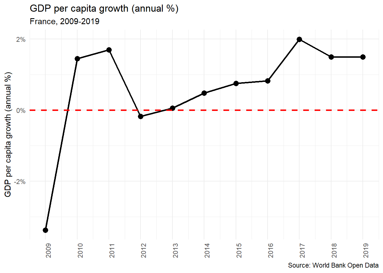
Now we have a very simple line chart of the GDP per captia growth in France from 2009-2019. The next step is making a chart like this for every country in the dataset, save that graph, and make a list of the file paths for all of these charts. This is where we are going to use a for loop. What for loops allow us to do is to repeat a task over and over again with different parameters. The first step in this process is to we need to first identify what parameters we will need to change for each graph. In this example there are three points where we have fill in, creating the dataset for the chart, the subtitle which mentions the country’s name, and the file name when we save our plot.
# Make a list of all unique countries
country_list <- unique(gdp_pct_growth_df$country)
In this first step we are creating a list of countries which we will use to tell R what to iterate through. Here we are using the unique() function which will give us all of the unique values for the variable country in our dataset, that is to say, all unique country names.
# Create a blank file path list to append to
file_path_list <- list()
Next, we are going to make a blank list. We will use this in our loop to create a list of file paths for all of the graphs we create. We will use this later when we build our PowerPoint decks with the officer package.
The next code chunk is the full for loop for creating and saving the graphs.
# For loop that produces graphs for every country
for (i in seq_along(country_list)) {

  # Step 1
  # For each iteration, create a df for only that country

  df <- filter(gdp_pct_growth_df, country == country_list[i])

  # Step 2
  # For each iteration, create a plot
  # Use paste0(country_list[i]), to change labels when needed

  plot <- ggplot(df, aes(x = date, y = gdp_pct_growth)) +
    geom_line(size = 1) +
    geom_point(size = 3) +
    geom_hline(yintercept = 0, linetype = "dashed", color = "red", size = 1) +
    scale_x_continuous("Year", breaks = seq(2009, 2019, 1), limits = c(2009, 2019)) +
    scale_y_continuous("GDP per capita growth (annual %)", labels = scales::percent) +
    labs(
      title = "GDP per capita growth (annual %)",
      subtitle = paste0(country_list[i], ", ", "2009-2019"),
      caption = "Source: World Bank Open Data"
    ) +
    theme_minimal() +
    theme(
      axis.title.x = element_blank(),
      axis.text.x = element_text(angle = 90)
    )

  # Step 3
  # Store file path
  # str_replace_all replaces countries names so that it is alpha numeric to avoid invalid file path issues.

  plot_file_path <- paste0(getwd(), "/graphs/", str_replace_all(country_list[i], "[^[:alnum:]]", "_"), ".png")

  # Append file path to list for each iteration
  file_path_list <- append(file_path_list, list(plot_file_path))

  # Step 4
  # Save the graph
  ggsave(filename = plot_file_path, plot = plot, width = 7, height = 5, units = "in", scale = 1, dpi = 300)
}
Here is how the loop works:
It starts by creating a data frame for the iteration. To do this we use the
filterfunction to filter the dataset based on the country incountry_list[i]Next it creates the plot. The code here is almost identical to the the we used to make the the graph for France. The only difference is that we need to change the subtitle so that it changes based on the country the loop is iterating through. To do this we use the
paste0function, this allows us to concatenate strings pragmatically, so that we have both the country name and the years that it covers in the subtitle.The next step is to create a file path and store it as object. Here we are using the
paste0()function again. We first grab the working directory withgetwd(), add in the subfolder ‘graphs’ and then lastly, name the image file. Here we are using thestr_replace_all()function from thestringrpackage to remove all non-alphanumeric characters from the country names. Saving files with apostrophes or periods can often result in errors, so it is best to just avoid them completely. Once we have created our file path, we append it to the master lists of file paths that include all iterations in the loop.Lastly, we save the graphs. Take note of the width and the height, as that is something we will need to be aware of when we prepare our PowerPoint.
The result is a graph for every country in our dataset saved to your hard drive and a list of file paths for each of those graphs (file_path_list).
3. Prepare the PowerPoint
When manipulating PowerPoints using the officer package, we need to create a ‘template’ PowerPoint deck, where we can specify the layout that we want our slides to have. In PowerPoint you do this through the ‘slide master’ view. If you don’t know how layouts in PowerPoint work, Microsoft provides a good overview of how they work. Since the titles of the graphs are in the image themselves, we can just make a new layout type with a content box that has the same dimensions as the graphs that we saved (7 inches by 5 inches). If the dimensions don’t match you’ll end up with some weird scaling and warping issues.
Here is what the template PowerPoint we will be working with looks like in the slide master view.
Once we have created PowerPoint template deck we can use read_pptx() to read in our PowerPoint into R.
library(officer)

# Read in template
template_pptx <- officer::read_pptx("template.pptx")
Next, we can use the layout_summary() function to take a look at the different types of slide layouts we can use.
# Look at summary of slide layouts
officer::layout_summary(template_pptx)
| layout | master |
|---|---|
| Title Slide | Retrospect |
| Two Content | Retrospect |
| Graph | Retrospect |
Here we have three different layouts, all from the same slide master “Retrsospect”. The custom slide that I have made is the layout “Graph”, while the other two are default layouts. We can take a closer look at the different elements with the “Graph” layout using layout_properties().
# Look at layout properties
officer::layout_properties(x = template_pptx, layout = "Graph")| master_name | name | type | id | ph_label | |
|---|---|---|---|---|---|
| 3 | Retrospect | Graph | body | 10 | Content Placeholder 2 |
| 7 | Retrospect | Graph | body | 5 | Rectangle 4 |
| 8 | Retrospect | Graph | body | 6 | Rectangle 5 |
This table shows us the different elements in the “Graph” slide layout. The most important element is “Content Placeholder 2” which is where the graph will go in the slide. The two rectangle elements are just aesthetic elements in the footer of the slides.
4. Make a loop that adds the graphs to the PowerPoint
Now that we have the information about the layout of the PowerPoint template we can build our loop. We are going to be using four different functions from the officer package:
add_slide()- This function is fairly self explanatory, it adds a slide to a pptx object. In this case we have read in our pptx object astemplate_pptx.ph_with()- This function adds a new shape or object into the existing slide. The two arguments will be using arevalueandlocationexternal_img()- This function reads in a specified external image so that it can be embedded into a PowerPoint slide.ph_location_label(). - This function is used in conjunction with ‘ph_with()’ to specify where an object should be added into the PowerPoint slide.
Something that is a bit confusing (for me at least) is how add_slide() adds a slide the to the specified PowerPoint and then overwrites the original PowerPoint object. I think this is best illustrated with an example.
I’ll start by looking at a summary of the blank PowerPoint template_pptx, using pptx_summary().
officer::pptx_summary(template_pptx)NULLSince there is are no slides, we get nothing returned. Now I’ll add one slide.
officer::add_slide(template_pptx,
  layout = "Title Slide",
  master = "Retrospect") %>%
  officer::ph_with(
    value = "Test Title 1",
    location = ph_location_label(ph_label = "Title 1")
  )

officer::pptx_summary(template_pptx)| text | id | content_type | slide_id |
|---|---|---|---|
| Test Title 1 | 2 | paragraph | 1 |
Now we have one slide containing only a title. If we were to rerun the code that we just ran, we would add the same slide again. It wouldn’t overwrite anything we just would have two of the same slides.
officer::add_slide(template_pptx,
  layout = "Title Slide",
  master = "Retrospect") %>%
  officer::ph_with(
    value = "Test Title 1",
    location = ph_location_label(ph_label = "Title 1")
  )

officer::pptx_summary(template_pptx)| text | id | content_type | slide_id |
|---|---|---|---|
| Test Title 1 | 2 | paragraph | 1 |
| Test Title 1 | 2 | paragraph | 2 |
This is important to know both when for writing loops, but also when using the add_slide() function in general. You have to take extra care that your script is written in the order that you want the slides to appear, and when you are experimenting you need to be sure to clear out the pptx object by reading in the blank one so you don’t end up having a ton of ‘work in progress’ slides in your deck.
Now that we know how add_slide() works, it is time to write a loop. Before we used country_list to iterate through our loop but this time we are going to use the file_path_list that we created earlier. This is because the one parameter that we are changing is no longer country names, but rather where the image files are on our computer.
# Copy blank pptx to gdp_growth_pptx (which will be our final pptx)
gdp_growth_pptx <- template_pptx

# Loop to add slides
for (i in seq(file_path_list)) {
  plot_png <- external_img(file_path_list[[i]])

  add_slide(gdp_growth_pptx,
    layout = "Graph",
    master = "Retrospect") %>%
    ph_with(
      value = plot_png,
      location = ph_location_label(ph_label = "Content Placeholder 2")
    )
}
We start first by copying the template_pptx to a new object called gdp_growth_pptx. Because add_slide() is adding slides to the PowerPoint object, it is good to have a template object that you never change. The loop itself works in two steps. First read in saved ggplot2 image using external_img() then add it to the slides using add_slide() to specify the PowerPoint object and the layout, and ph_with() to specify what should be embedded and where it should be embedded in the slide.
The final product is single PowerPoint with a 217 slides, one for each country showing the GDP annual % growth from 2009-2019. To export this PowerPoint object you use the print() function.
# Export
print(gdp_growth_pptx, target = "gdp_per_capita_%_growth_slide_deck.pptx") 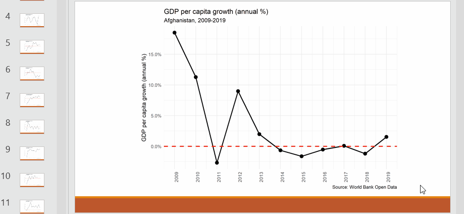
This example is probably the simplest automation of PowerPoint reports you could make, only one paremeter changes when creating the graphs using ggplot2 and we are assuming that ther order doesn’t matter. However, this is a good starting point, reports with more complexity can be made using the techniques outlined in this post.
Bonus. Avoiding (some) loops by using the map function
For loops in R are often discouraged because they can be overly verbose and result in a ton of copying and pasting where small parameters are tweaked. An alternative approach to for loops is to use functionals like the map() functions from the purrr package. How these functions work is neatly summed up in the excellent book R for Data Science:
Each function takes a vector as input, applies a function to each piece, and then returns a new vector that’s the same length (and has the same names) as the input.
In our case we will create a custom function with the same parameters as the for loop we made in Step 2, this will be called country_graph(). Then we will use use the map() function, input our ‘country_list’ vector, and use country_graph(). The end result will give us a list of ggplot2 graphs, one for each country in our dataset.
Rewriting our loop as a function, isn’t super difficult. In practice, this means rewriting our code so that instead of using country_list[i] for the parameters that we need to change between iterations, we use x. This function has also been reworked so that we aren’t saving the files to the hard drive in this function, but rather just creating a ‘ggplot2’ plot.
# Create a function to make the graph

country_graph <- function(x) {

  # X argument is country name

  df <- filter(gdp_pct_growth_df, country == x)

  ggplot(df, aes(x = date, y = gdp_pct_growth)) +
    geom_line(size = 1) +
    geom_point(size = 3) +
    geom_hline(yintercept = 0, linetype = "dashed", color = "red", size = 1) +
    scale_x_continuous("Year", breaks = seq(2009, 2019, 1), limits = c(2009, 2019)) +
    scale_y_continuous("GDP per capita growth (annual %)", labels = scales::percent) +
    labs(
      title = "GDP per capita growth (annual %)",
      subtitle = paste0(x, ", ", "2009-2019"),
      caption = "Source: World Bank Open Data"
    ) +
    theme_minimal() +
    theme(
      axis.title.x = element_blank(),
      axis.text.x = element_text(angle = 90)
    )
}
We can use this function on it’s own if we want to make graphs for specific countries. This can be a practical alternative if you don’t need to create graphs for all of the different groups in a given dataset.
# Create a graph for Zimbabwe
country_graph("Zimbabwe")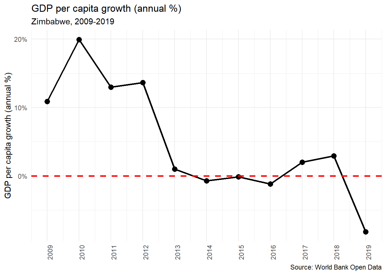
In the next step, we use map() to apply country_graph() to country_list and save those results as country_graph_list (please excuse my very creative naming conventions).
# Use map to make graphs
# set_names() sets the names of a list based on their values
country_graphs_list <-  set_names(country_list) %>%
  purrr::map(country_graph)
Now we have a a list of ggplot2 graphs. This means we can call the plots for each country by calling elements in the list.
country_graphs_list$Uganda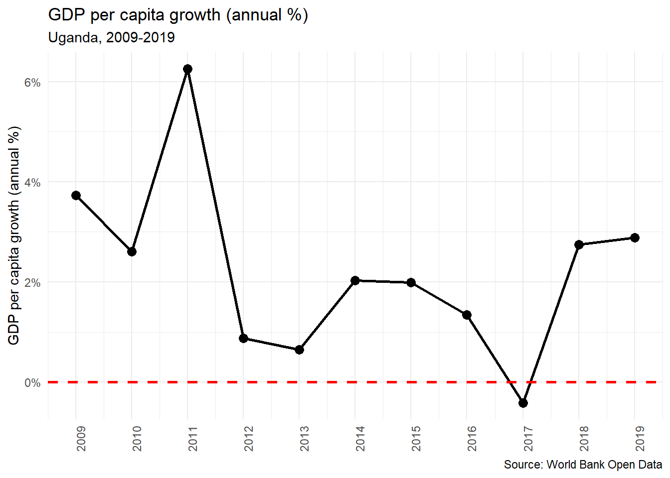
To take this list and put all of the gglot2 graphs into a PowerPoint we use a similar loop as we used before, but this time we are a looping over the country_graph_list and instead of adding in external images, we are directly calling the ggplot2 object in the value parameter of ph_with().
# Copy blank pptx to gdp_growth_pptx (which will be our final pptx)
gdp_growth_pptx <- template_pptx

# Loop to add slides
for (i in seq(country_graphs_list)) {
  add_slide(gdp_growth_pptx,
    layout = "Graph",
    master = "Retrospect") %>%
    ph_with(
      value = country_graphs_list[[i]],
      location = ph_location_type(type = "body")
    )
}
While this approach is more streamlined and seemingly simpler, the reason I prefer using external images is that the proportions and the ggplot2 are easier to control. When using this technique the titles and subtitles are much smaller in the PowerPoint and I am not sure the best way to fix that. But, like all things in R, I am sure there is just a solution I haven’t figured out yet.